
Project Brief
“TEN LAWS 3 KEYS” challenges to explore advanced typographic communication principles, particularly focusing on sequential systems, typographic hierarchy, and large-scale prototypes. create a 100-page book on the Laws of Simplicity, applying the principles they learn to design a visually compelling and easy-to-navigate book. This project blends typography and information hierarchy while focusing on simplifying complex ideas through effective design choices.
Through this project I consider various aspects of design, including layout, typeface selection, spacing, and color, to ensure that the book is both aesthetically pleasing and functional from the original book “Law of Simplicity” by John Maeda. This project required sequential systems that organize information logically, establish a clear typographic hierarchy, and produce a cohesive visual experience across all pages. In addition developing their ability to think critically about how typography and design choices influence the communication of ideas. The end goal is to effectively convey intricate concepts through type, demonstrating their ability to create impactful and user-friendly design solutions.

INSIGHTS:
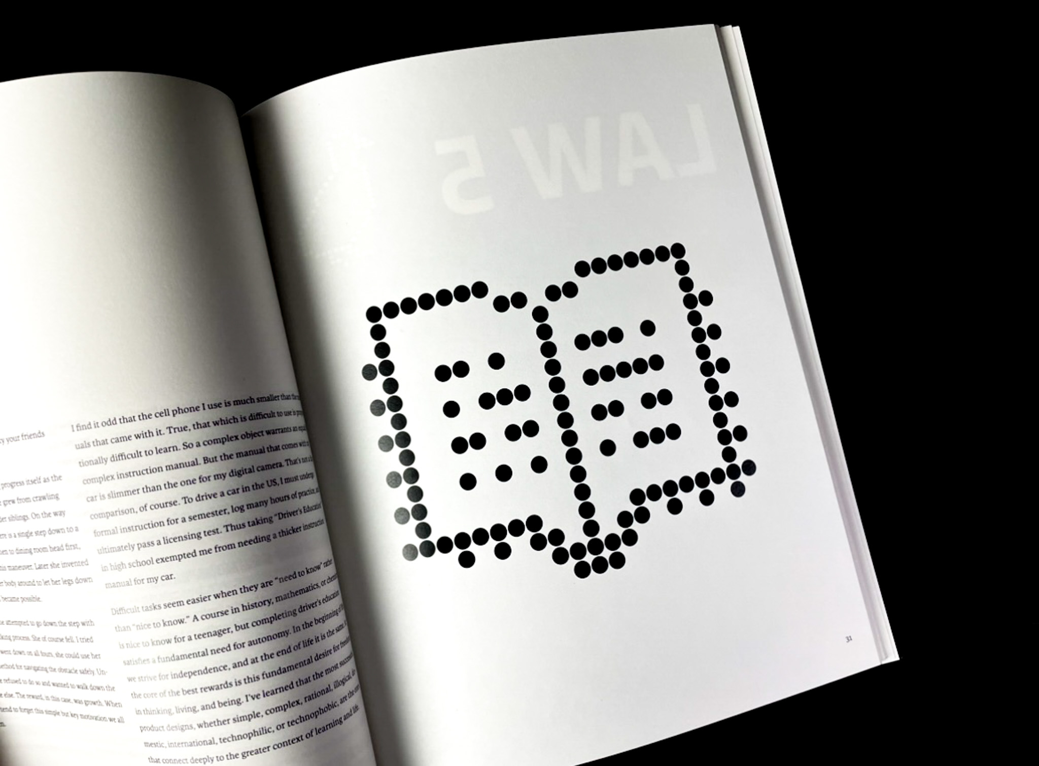
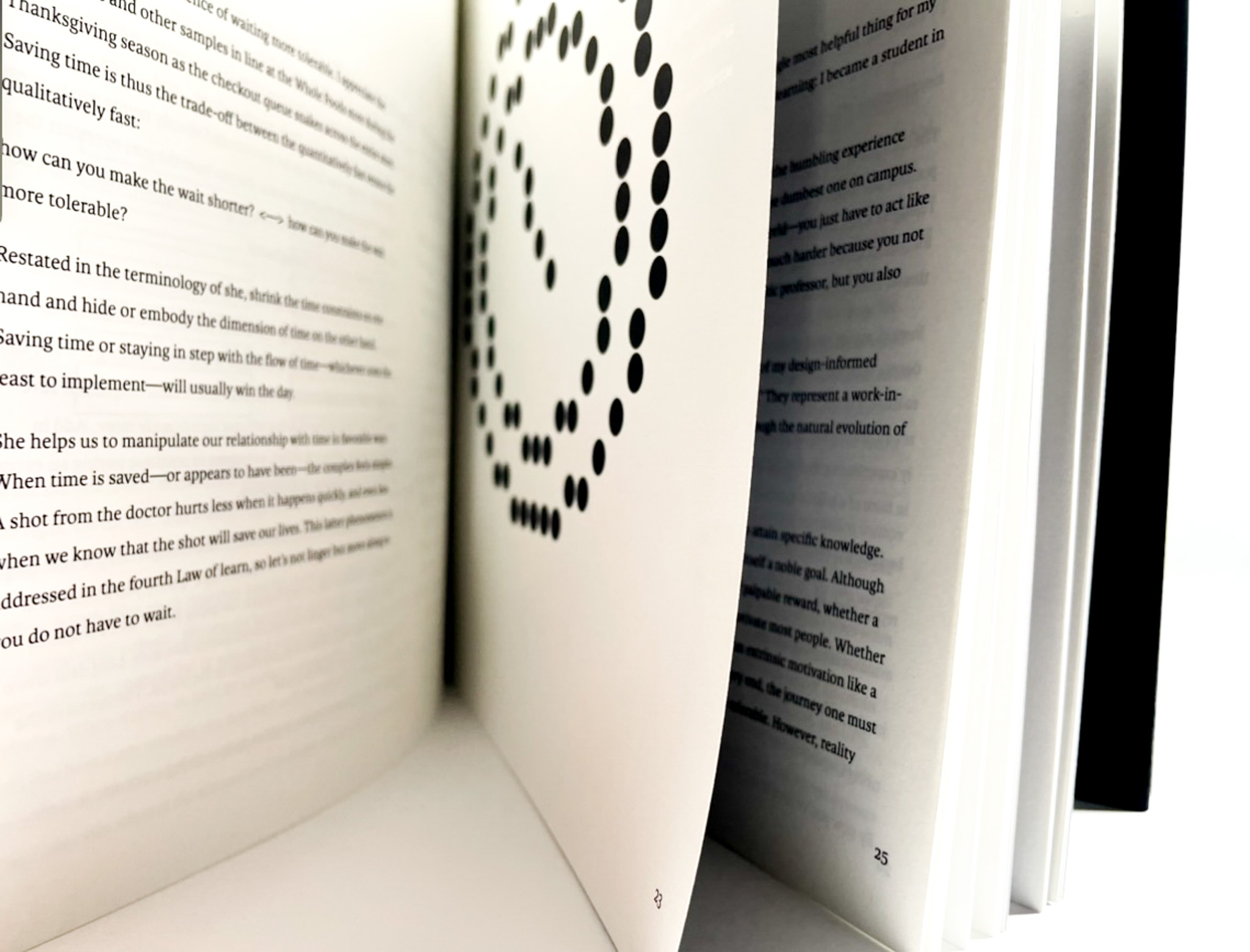
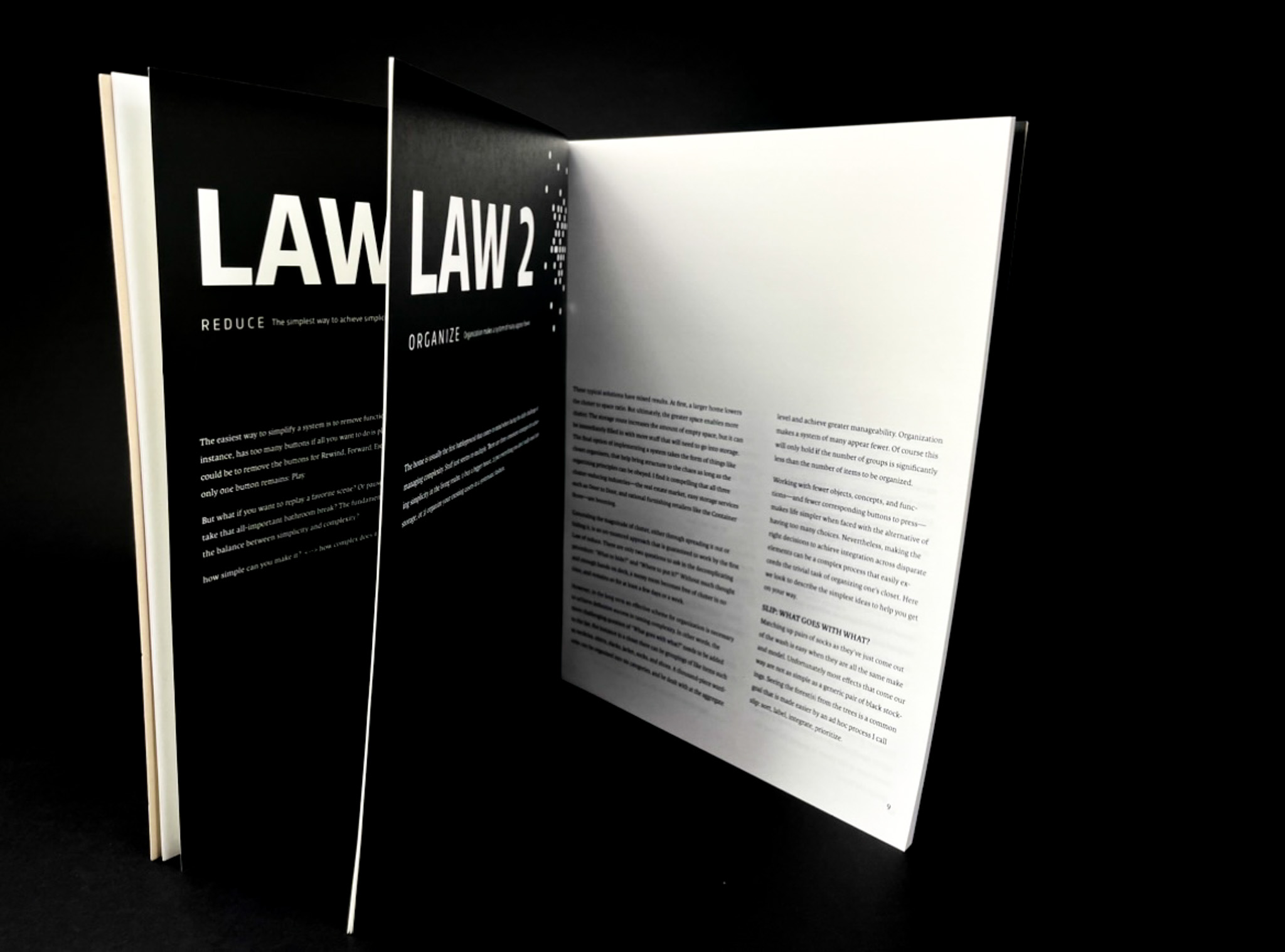
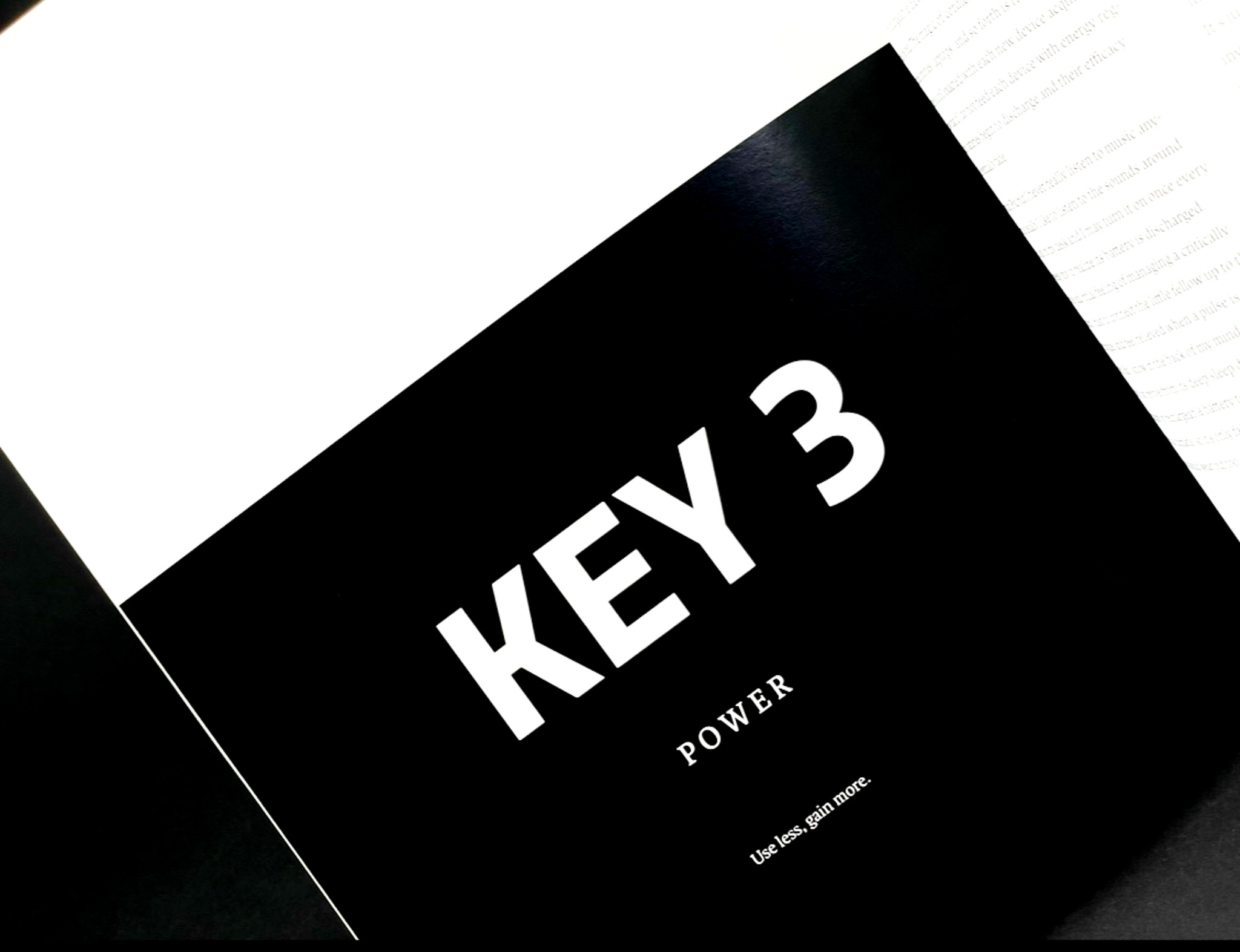
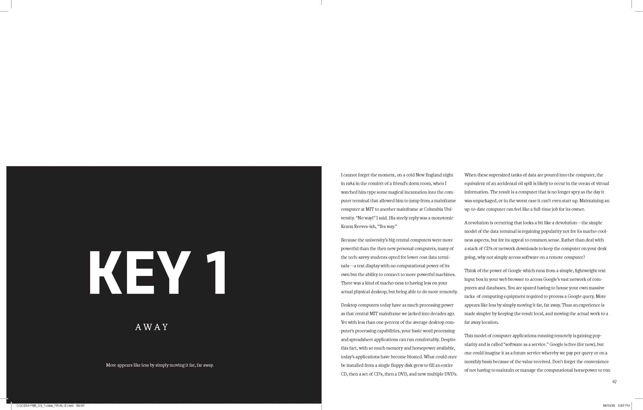
Throughout my exploration process I noticed that A key part of this project is ensuring the reader can easily follow the flow of information across different sections and ideas. Using a sequential typographic system means creating visual consistency and flow in how type is organized across pages. I wanted to stand out by using a minimalist approach that focuses on each topic header on the left page to let readers know this is another chapter leading to another topic in the book.
TECHNICAL SPECIFICATIONS :
Made in InDesign
- Page Size: 8" x 10" (letter) / Spread Size: 10" x 8" (tabloid)
- Page Count: 96 + Cover (100 pages total) — approximately
- Print/Output: FedEx Kinkos — black & white
- Binding: Internally // Perfect-bound


Process
The process of creating the "TEN LAWS 3 KEYS" book involves applying advanced typographic communication principles, with a focus on sequential systems, typographic hierarchy, and large-scale prototypes. This 100-page book, based on John Maeda’s "Laws of Simplicity," requires careful consideration of design elements like layout, typeface selection, spacing, and color to simplify complex ideas and ensure the book is both visually compelling and easy to navigate. Throughout the project, designers organize information logically and establish a cohesive visual experience across all pages. The process challenges critical thinking about how design choices impact communication, with the end goal of creating an impactful, user-friendly book that effectively conveys intricate concepts through typography.
P02_StEP 1_TYPE SYSTEM OUTLINE
The process of the Type system outlined in the "TEN LAWS 3 KEYS" book project defines the rules and structure for how typography and order of heads are used consistently throughout the design. It establishes a cohesive framework for font choices, sizes, weights, and styles, ensuring that the typographic elements work together to create clarity, visual hierarchy, and harmony. The type system guides decisions on pairing different fonts, setting appropriate line spacing (leading), letter spacing (kerning), and applying font variations like bold or italic for emphasis.


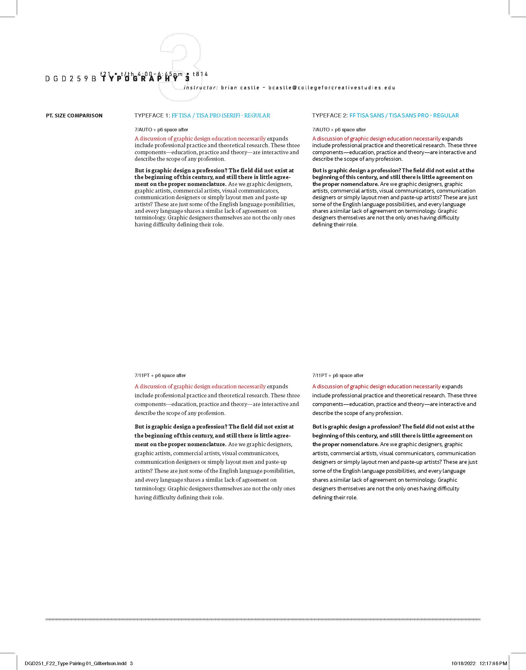
Next is the process of Type pairings. In the "TEN LAWS 3 KEYS" book the process of type pairing involves selecting and combining complementary typefaces to create visual contrast and hierarchy, strengthening both readability and aesthetics. The process of pairing typefaces requires careful consideration of how different fonts interact in terms of weight, style, and personality. Designers aim to balance contrast and harmony, ensuring that each typeface serves a specific purpose, such as distinguishing headings from body text or emphasizing key points. Effective type pairings help guide the reader through the content, making the book more engaging while reinforcing the clarity and impact of the information being presented.


P02_STEP 3_GRID EXPLORATION
Furthermore is the process of Grid exploration in the "TEN LAWS 3 KEYS" book. This process involves experimenting with different grid systems to structure the layout in a way that enhances visual flow and organization. The grid serves as the backbone of the design, ensuring that elements such as text, images, and whitespace are aligned and balanced across the pages. By exploring various grid structures—like single-column, multi-column grids I create a foundation for consistent spacing, rhythm, and hierarchy throughout the book.
This exploration helps in determining how content is placed and how the reader's eye is guided across the pages. Grids allow for flexibility, providing a structured framework while still offering room for creative layouts. Effective grid use supports readability, reinforces typographic hierarchy, and ensures that the complex concepts in the book are communicated in a clear, accessible way. Through grid exploration, the book achieves both cohesion and visual interest, making it easy to navigate and visually engaging.
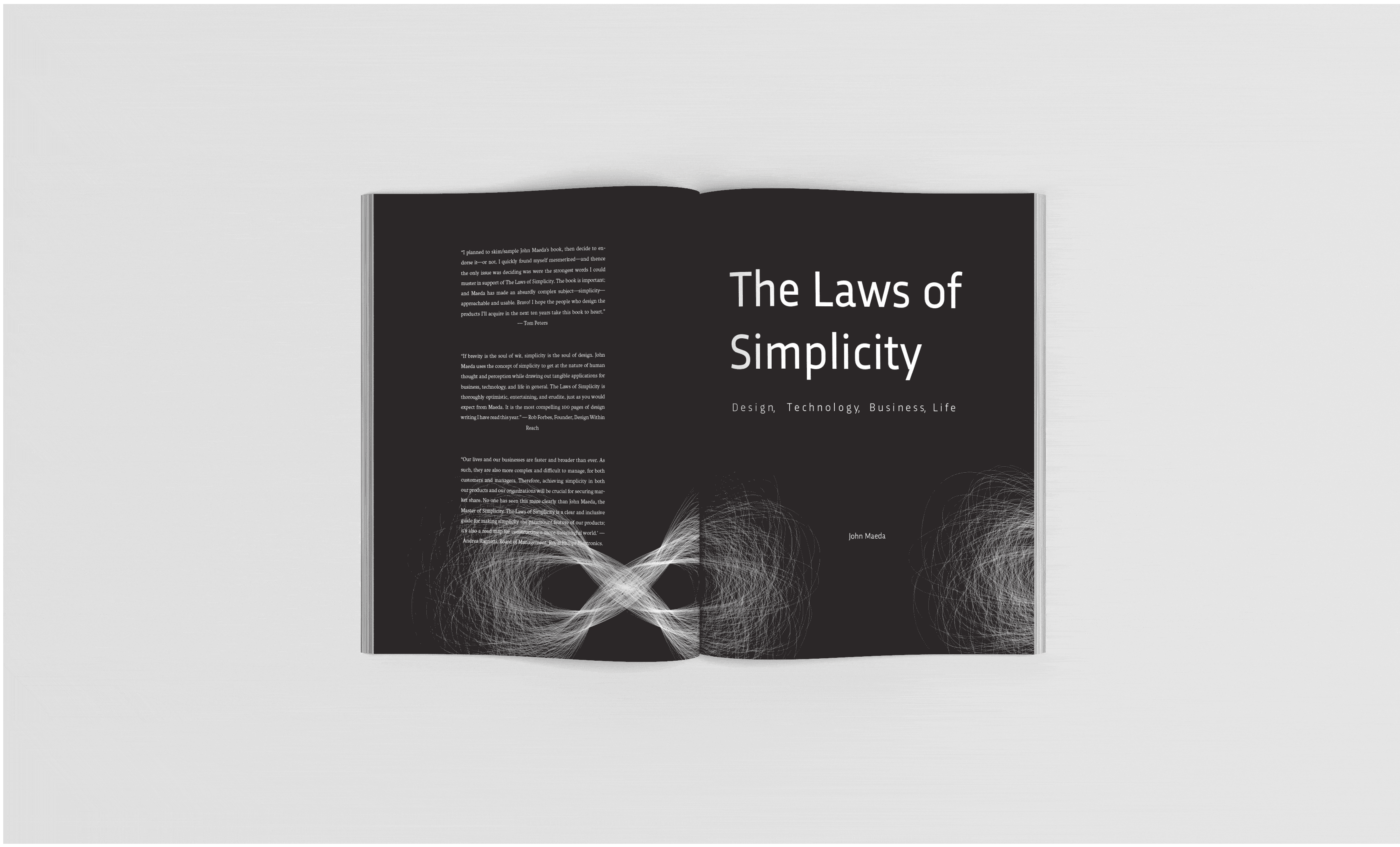
 DGD251_P02_COVER
Last but not least is the finishing cut of designing the cover layout. The book cover design for the "TEN LAWS 3 KEYS" project is a last critical element that encapsulates the essence of the book’s focus on advanced typographic communication principles. It visually reflects the core ideas of simplicity, hierarchy, and design, and structure as explored in the book, while drawing inspiration from John Maeda’s "Laws of Simplicity." The cover balances clarity and creativity, using thoughtful typography, minimalistic design, and effective use of space and color to create an impactful first impression. The design serves as a visual introduction to the book's content, engaging readers through a compelling combination of type, layout, and imagery that reflects the book’s emphasis on simplifying complex ideas through design.
