
Project Brief
‘’Jiffy Rebrand” is a exploration that considers a uplifting new brand refresh and new audience activation for the iconic and authentic Jiffy mix. Based on the iconic Jiffy Mix origin I shed light to the originator innovator, Mabel White Holmes’ and bring story to life.
I started by reimagining the Jiffy brand with a new tagline that honors her spirit of experimentation and innovation. Inspired by her hands-on approach to perfecting the recipe, the new tagline emphasizes the journey of trial, discovery, and refinement that led to America’s most beloved cornbread mix. Just as Mabel carefully balanced ingredients to create a foolproof baking solution, the updated branding reflects the mix’s legacy of simplicity, reliability, and home-baked tradition. Researching Jiffy and its historic brand as well as the product category, helps strategically redesign the packaging in order to extend the brand’s market reach in the retail environment.


TECHNICAL SPECIFICATIONS:
1.) Adobe Illustrator (CMYK)
2.) Photoshop


PROCESS
INSPIRATION/ MOODBOARD -
Drawing inspiration from both illustrative and photographic styles, the redesigned packaging captures the balance of tradition and modern appeal. The fusion of hand-drawn elements with authentic photography reflects the journey of trial, discovery, and refinement that shaped Jiffy’s legacy. Just as Mabel perfected her recipe through careful craftsmanship, the updated visuals blend warmth, nostalgia, and approachability to reinforce the brand’s heritage while strategically expanding its presence in the retail market.

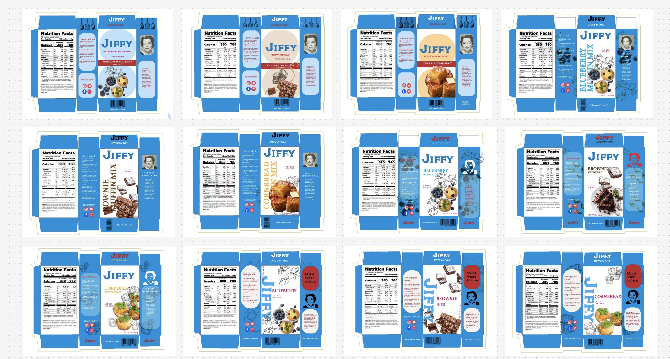
PROCESS ITERATIONS
Next we start with multiple design iterations, the packaging evolution embraces both illustrative and photographic elements to strike a balance between heritage and modern appeal. Early explorations focused on refining visual storytelling—experimenting with typography, composition, and color to enhance brand recognition while preserving the warmth of tradition. Testing different illustrative styles against photographic textures helped establish an authentic yet contemporary look. Feedback and strategic refinements ensured the final design maintained simplicity, reliability, and an inviting presence on retail shelves, reinforcing Jiffy’s legacy while appealing to new audiences

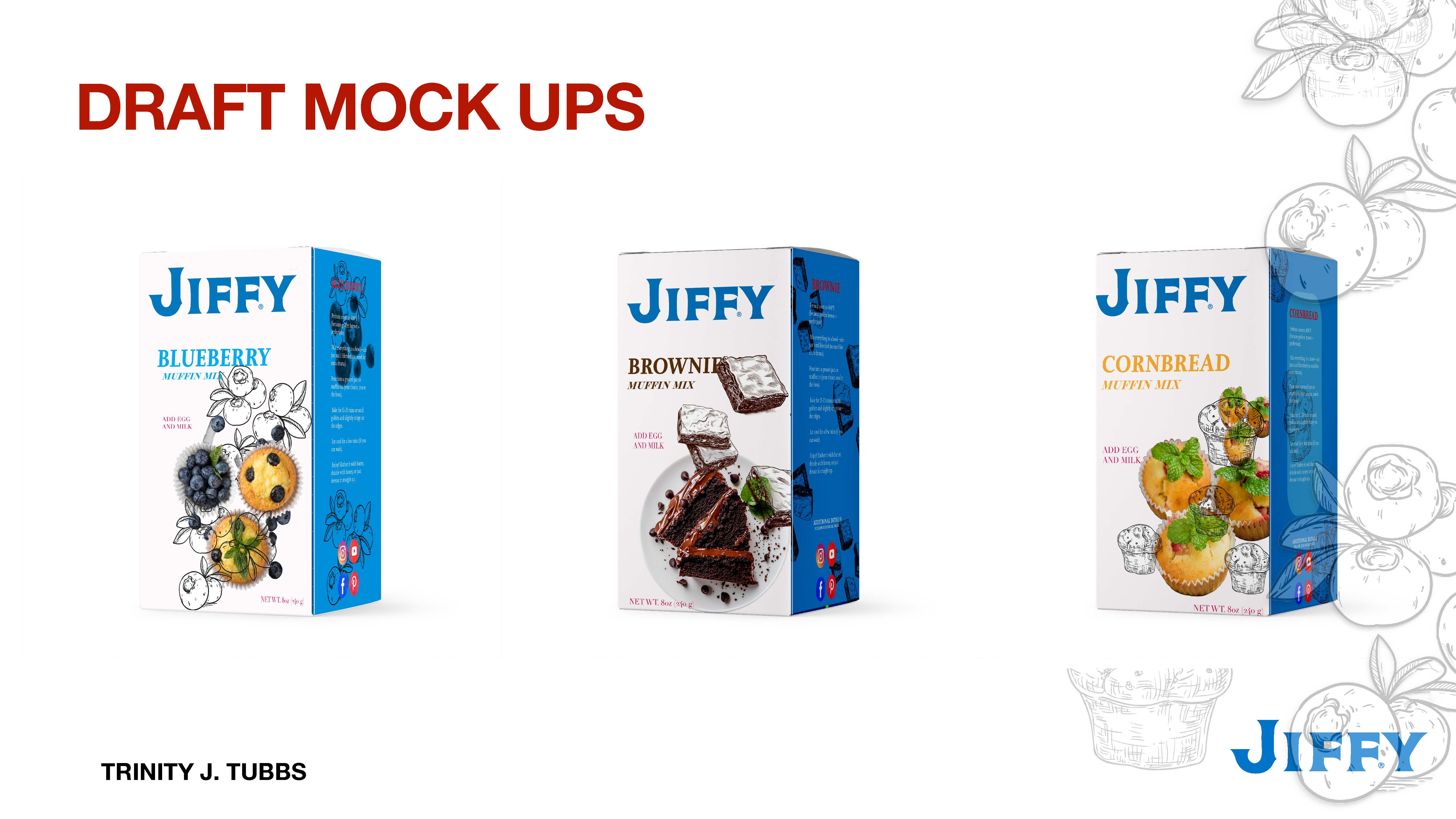
MOCK UPS
Last but not least as i pick my final look I go by applying the updated design to 3D renderings and physical prototypes, the iterations were tested for shelf impact, brand consistency, and consumer appeal. These mockups explore how the fusion of illustrative and photographic elements enhances the packaging’s storytelling, ensuring the balance of nostalgia and modernity translates effectively across various retail settings. Through refinement based on visual hierarchy, legibility, and market positioning, the final mockups present a cohesive, strategic redesign that strengthens Jiffy’s legacy while expanding its reach.
JIFFY BRAND REFRESH