
Project Brief
‘’Drink Up ” is a conceptual tincture brand designed to shift your mood, not just match it. Rooted in the idea that drinks can be emotional tools, not just physical refreshments, Drink Up offers a sensory experience that helps people move from one emotional state to another—whether it’s from stress to clarity, exhaustion to motivation, or sadness to lightness. It challenges the sanitized, overly serene ideals of wellness by embracing real feelings and giving people permission to change how they feel on their own terms. Through bold visuals, mood-based naming, and a raw, empowering tone of voice, Drink Up acts as a catalyst for emotional transformation—one sip, one shift at a time.
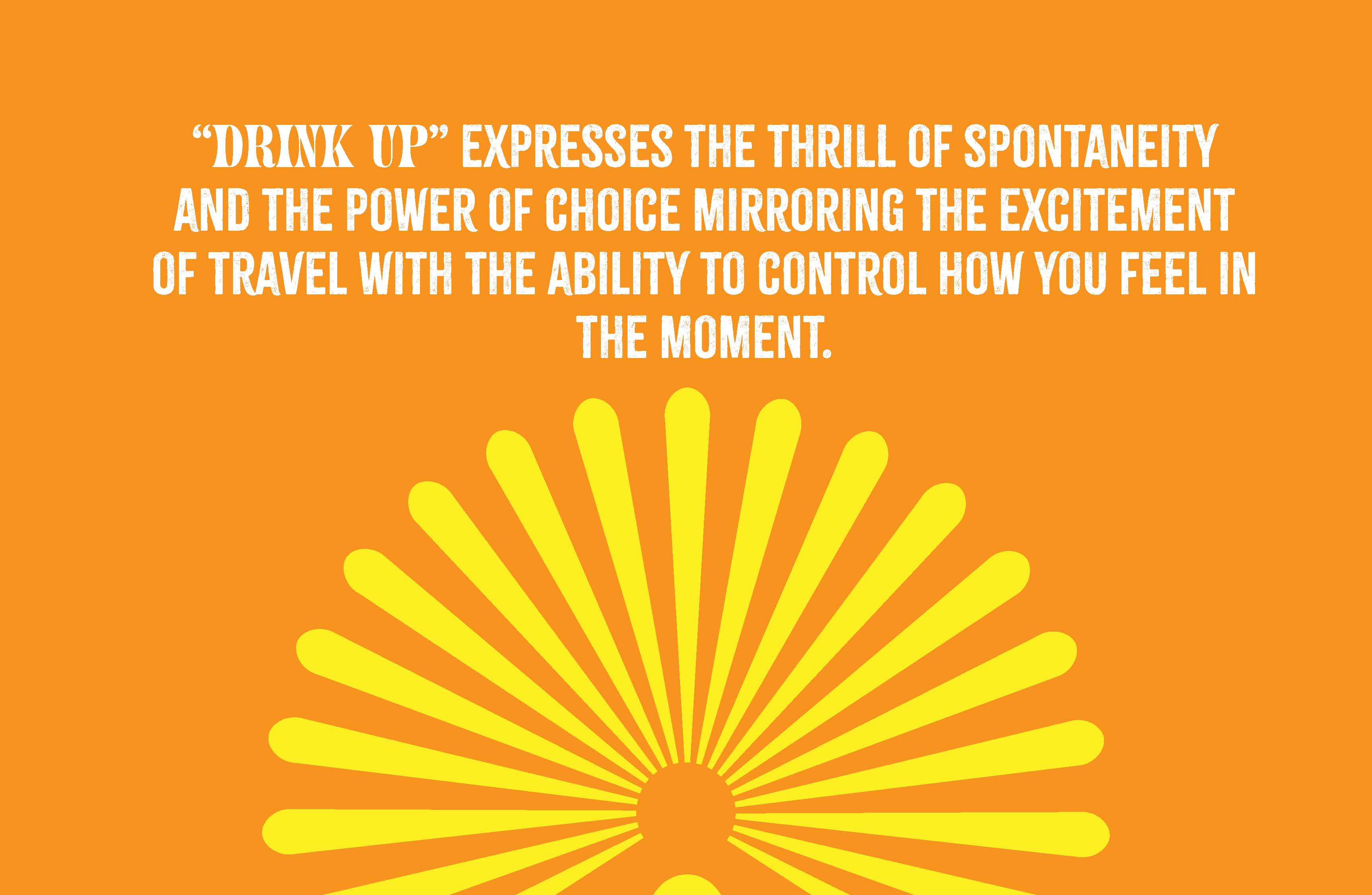
I aimed to create a healthy holistic brand tinctures that expresses the concept thrill and spontaneity and the power of choice—mirroring the excitement of travel with the ability to control how you feel in the moment. Benerage tinctures empower users to fuel their mood and energy, allowing them to embrace adventure while enhancing well-being. Whether exploring the unknown or navigating daily life, Benerage transforms every moment into an opportunity to choose your experience


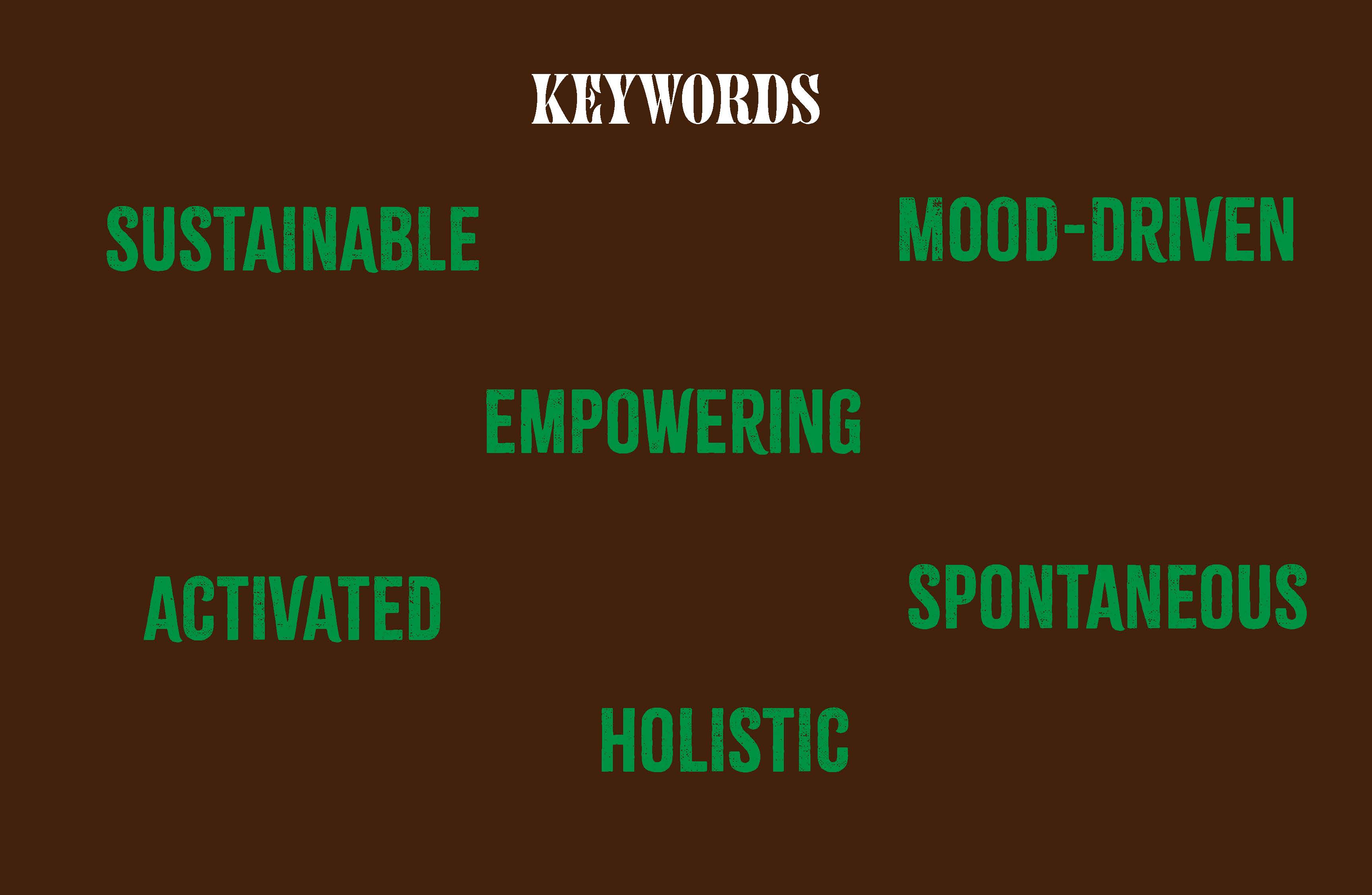
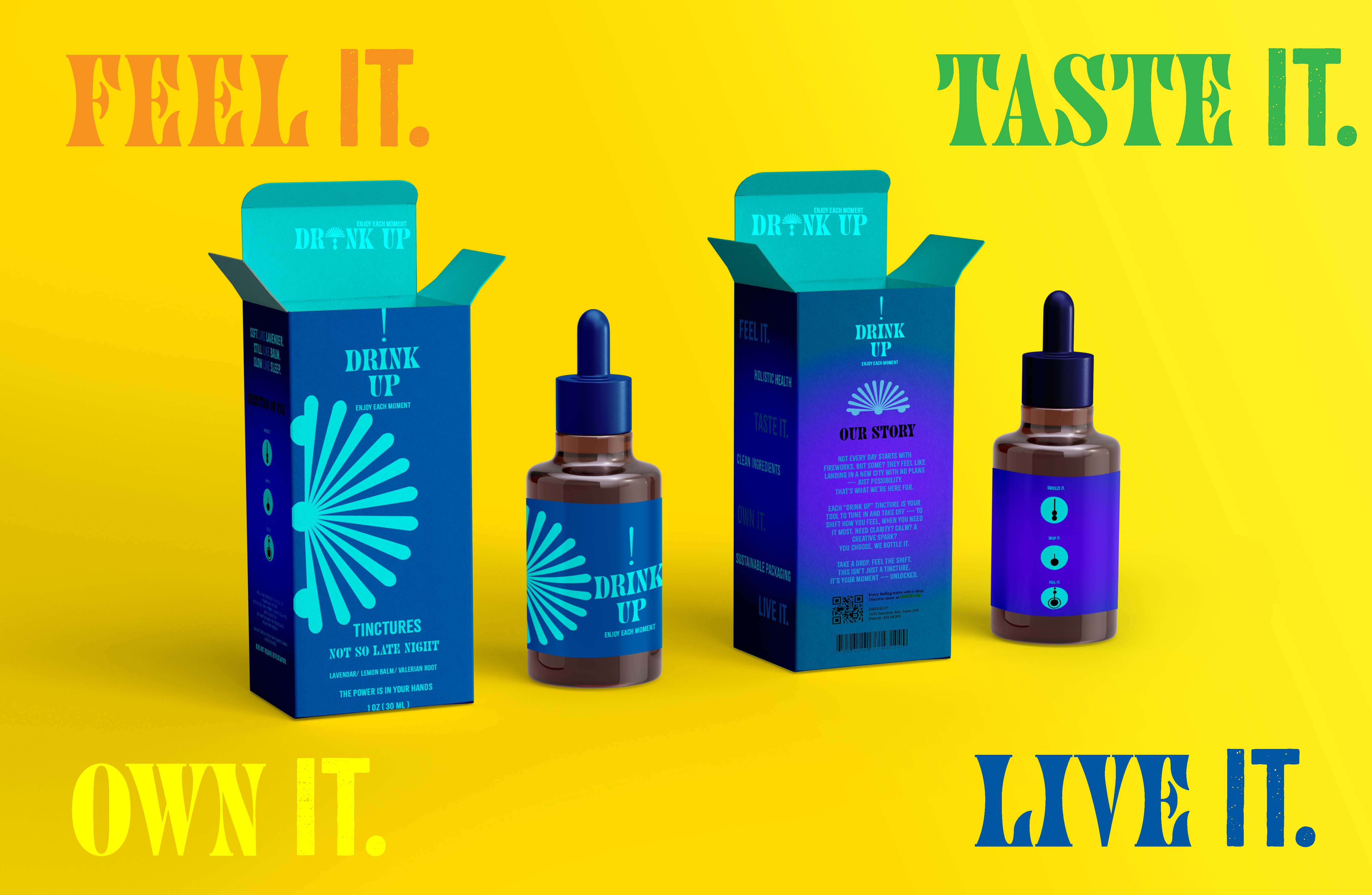
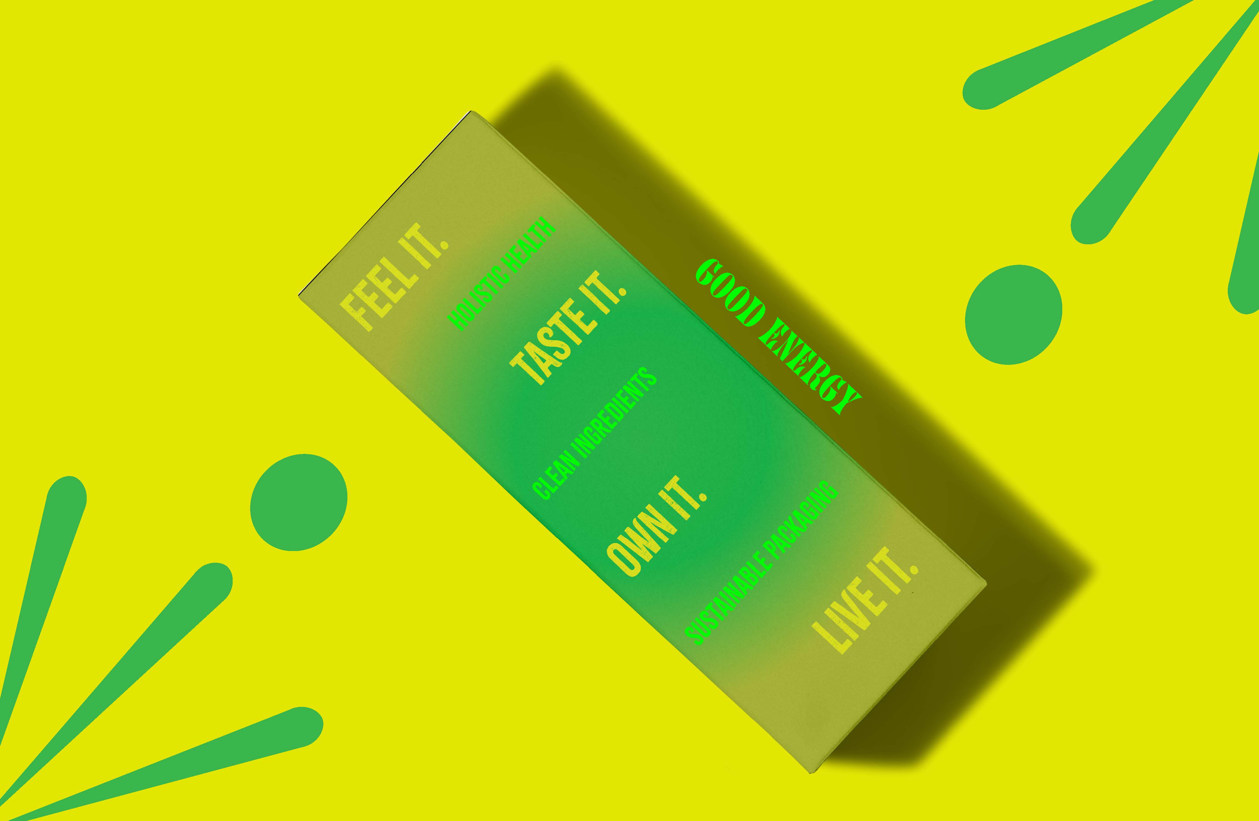
Throughout the creation of Drink Up, I learned how every step of the packaging design process—from concept to final prototype—requires deep intention, consistency, and experimentation. Starting with the concept of mood enhancement, I built a brand rooted in excitement, inspired by the energy of carnivals, fireworks, and circular, dynamic forms. This mood translated into a bold visual system full of vibrant colors, rounded shapes, and expressive typography that mirrored the emotional burst the drink delivers. I explored structural packaging design by developing dielines, understanding bleed, fold, cut, and glue lines, and using them to create a functional yet visually immersive physical product. Designing within these technical constraints helped me respect both form and function, ensuring the visual storytelling aligned with the physical experience of unboxing and using the product. I also had to consider branding holistically—microcopy, taglines, tone of voice, and storytelling—to ensure that every interaction felt consistent and emotionally resonant. In conclusion, I learned how packaging is a powerful communication tool, not just a container. It becomes a brand's handshake—something that can instantly shift mood, express identity, and invite consumers into a designed world of feeling.
TECHNICAL SPECIFICATIONS:
1.) Adobe Illustrator
2.) Photoshop
Process
The process of creating the Drink Up packaging design began with defining a clear concept rooted in mood transformation—designing not just a product, but an emotional shift in a bottle. I began by researching the holistic tincture market and identifying visual gaps where modern, expressive packaging could stand out. Mood-driven color theory guided the palette, selecting hues that evoke emotional change rather than static reflection. I sketched out bottle shapes, label layouts, and explored materials that felt tactile and ritualistic. Typography was chosen to feel assertive yet calming, reinforcing the brand's transformative tone of voice. Each design decision—from iconography to microcopy—was crafted to reflect the idea that this drink is a catalyst, not a mirror. Finally, prototyping and mockups allowed me to test how the packaging communicated its message both on-shelf and in-hand. Would you like a visual mockup or dieline template to go with this?

INSPIRATION
My inspiration for this concept is about My inspiration for the Drink Up packaging stemmed from the energy and spectacle of exciting experiences—carnivals, fireworks, and the vibrant chaos of celebration. I was drawn to circular forms and bold, rhythmic graphics that echo the dynamic movement of spinning rides, exploding lights, and festive noise. These visual cues informed both the layout and aesthetic of the packaging, resulting in a playful, high-energy design system that feels alive and mood-shifting. The circular motifs became a metaphor for joy in motion—capturing the essence of “changing the mood” through visual storytelling. Would you like to include a tagline or color explanation tied to that energy?
“DRINK UP” PACKAGING SYSTEM